A Comprehensive Guide to Utilizing the MACD Table for Multi-Timeframe Trading Insights
To fully leverage the MACD table generated by the indicator for trading, it's crucial to understand its components and how they provide valuable insights into market dynamics and potential trading strategies. Here’s a detailed explanation of how to interpret and use the table:
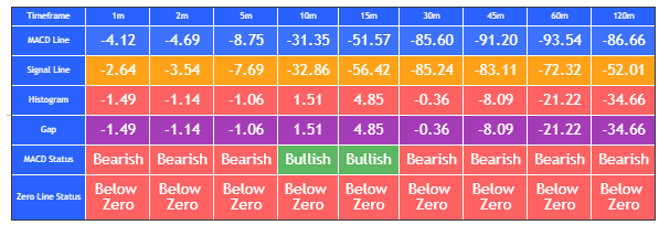
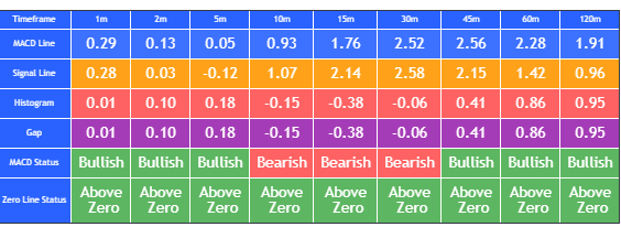
Components of the MACD Table
The table consists of several key columns, each offering specific information about the MACD indicator across different timeframes:
- Timeframe: This column lists various timeframes from 1 minute to 120 minutes, allowing traders to analyze short-term to long-term market movements.
- MACD Line: Represents the value of the MACD line for each timeframe. It is calculated by subtracting the longer-term moving average from the shorter-term moving average.
- Signal Line: Shows the value of the Signal line for each timeframe. It is a moving average of the MACD line.
- Histogram: The difference between the MACD line and the Signal line. It visually represents the momentum and the relationship between the MACD line and the Signal line.
- Gap: The absolute difference between the MACD line and the Signal line. It provides an additional measure of the distance between these two lines.
- MACD Status: Indicates whether the MACD line is above (Bullish) or below (Bearish) the Signal line.
- Zero Line Status: Indicates whether the MACD line is above or below zero, providing insight into overall market sentiment.
Using the MACD Table for Trading
The MACD table helps traders quickly assess the MACD conditions across multiple timeframes, offering a comprehensive view of market sentiment and potential trade setups. Here's how you can use it effectively:
1. Multi-Timeframe Analysis
Trend Confirmation:
- Consistency Check: By examining the MACD Status across multiple timeframes, you can confirm if the trend is consistent. For instance, if the MACD Status is Bullish on the 1m, 5m, 15m, and 30m timeframes, it suggests a strong uptrend.
- Example: If the MACD Status is consistently Bullish across shorter timeframes and up to the 30m timeframe, it indicates a robust short-to-medium term uptrend.
Divergence Identification:
- Potential Reversals: If shorter timeframes (e.g., 1m, 5m) show a Bearish MACD Status while longer timeframes (e.g., 60m, 120m) show Bullish, it could indicate a potential divergence and a possible trend reversal.
- Example: A Bearish MACD Status in the 5m and 15m timeframes, but Bullish in the 60m and 120m timeframes, might signal an upcoming bullish reversal after a short-term pullback.
2. Entry and Exit Signals
Bullish Entries:
- Identification: Look for timeframes where the MACD line is above the Signal line (Bullish MACD Status) and above zero (Bullish Zero Line Status). This indicates strong bullish momentum.
- Example: If the 1m, 5m, and 15m timeframes all show Bullish MACD and Zero Line Status, it suggests a good entry point for a long position.
Bearish Entries:
- Identification: Conversely, if the MACD line is below the Signal line (Bearish MACD Status) and below zero (Bearish Zero Line Status), it indicates bearish momentum.
- Example: If the 30m, 60m, and 120m timeframes all show Bearish MACD and Zero Line Status, it suggests a good entry point for a short position.
3. Histogram and Gap Analysis
Momentum Strength:
- Histogram Analysis: The Histogram column shows the difference between the MACD and Signal lines. A larger histogram value indicates stronger momentum. For example, a large positive histogram value in multiple timeframes suggests strong bullish momentum.
- Example: If the 1m, 5m, and 15m timeframes show large positive histogram values, it indicates strong bullish momentum in the short term.
Gap Analysis:
-
The "Gap" column in the context of the MACD table shows the absolute difference between the MACD line and the Signal line. This gap can provide useful insights into the strength and momentum of the current trend, but it's not directly about overbought or oversold conditions in the traditional sense (which are typically associated with indicators like RSI or stochastic).
Corrected Explanation of the Gap Column
Gap Analysis:
- Momentum Strength: The Gap column shows the absolute difference between the MACD line and the Signal line. A larger gap indicates stronger momentum in the direction of the current trend. For example, a large positive gap indicates strong bullish momentum, while a large negative gap indicates strong bearish momentum.
- Trend Reversal Potential: When the gap starts to narrow, it may signal a weakening of the current trend and a potential reversal. Conversely, a widening gap suggests that the current trend is strengthening.
- Example:
- If the gap in the 1m and 5m timeframes is large and positive, it suggests strong short-term bullish momentum.
- If the gap starts to narrow across multiple timeframes, it could indicate that the bullish trend is losing strength and a reversal may be forthcoming
4. Trend and Momentum Confirmation
Consistent Signals:
- Strong Confirmation: Look for consistent bullish or bearish signals across multiple timeframes. This can provide stronger confirmation of the trend and help avoid false signals.
- Example: If all timeframes from 1m to 120m show Bullish MACD Status, it strongly confirms an uptrend.
Zero Line Cross:
- Trend Changes: Pay attention to timeframes where the MACD line crosses the zero line, as this can indicate a significant change in trend.
- Example: If the MACD line crosses above the zero line in the 15m and 30m timeframes, it may signal the beginning of a bullish trend.
Practical Insights
Bullish Continuation:
- Analysis: If multiple timeframes show a Bullish MACD Status and a positive histogram, it suggests that the bullish trend is likely to continue.
- Example: Bullish MACD and positive histogram in the 1m, 5m, and 15m timeframes indicate continued upward momentum.
Bearish Reversal:
- Analysis: If you notice a Bearish MACD Status in shorter timeframes and a Bullish MACD Status in longer timeframes, it may indicate an impending bearish reversal.
- Example: Bearish signals in the 1m and 5m timeframes but Bullish in the 60m and 120m timeframes suggest a short-term pullback within an overall uptrend.
Neutral or Sideways Market:
- Analysis: If the MACD Status is mixed across timeframes (some bullish, some bearish), it suggests a choppy or sideways market, and it might be better to wait for clearer signals.
- Example: Mixed MACD signals across various timeframes indicate uncertainty and potential consolidation, advising caution and patience.
By regularly monitoring the table, you can stay informed about the current market conditions and make more informed trading decisions based on the MACD indicator across multiple timeframes. This comprehensive view helps in identifying high-probability trade setups and managing trades more effectively.


